Vacasa
Unit Page Redesign
Unit page drop-off was high for Vacasa and needed to be addressed. The redesign led to a decrease in drop offs and increased bookings.
Understand
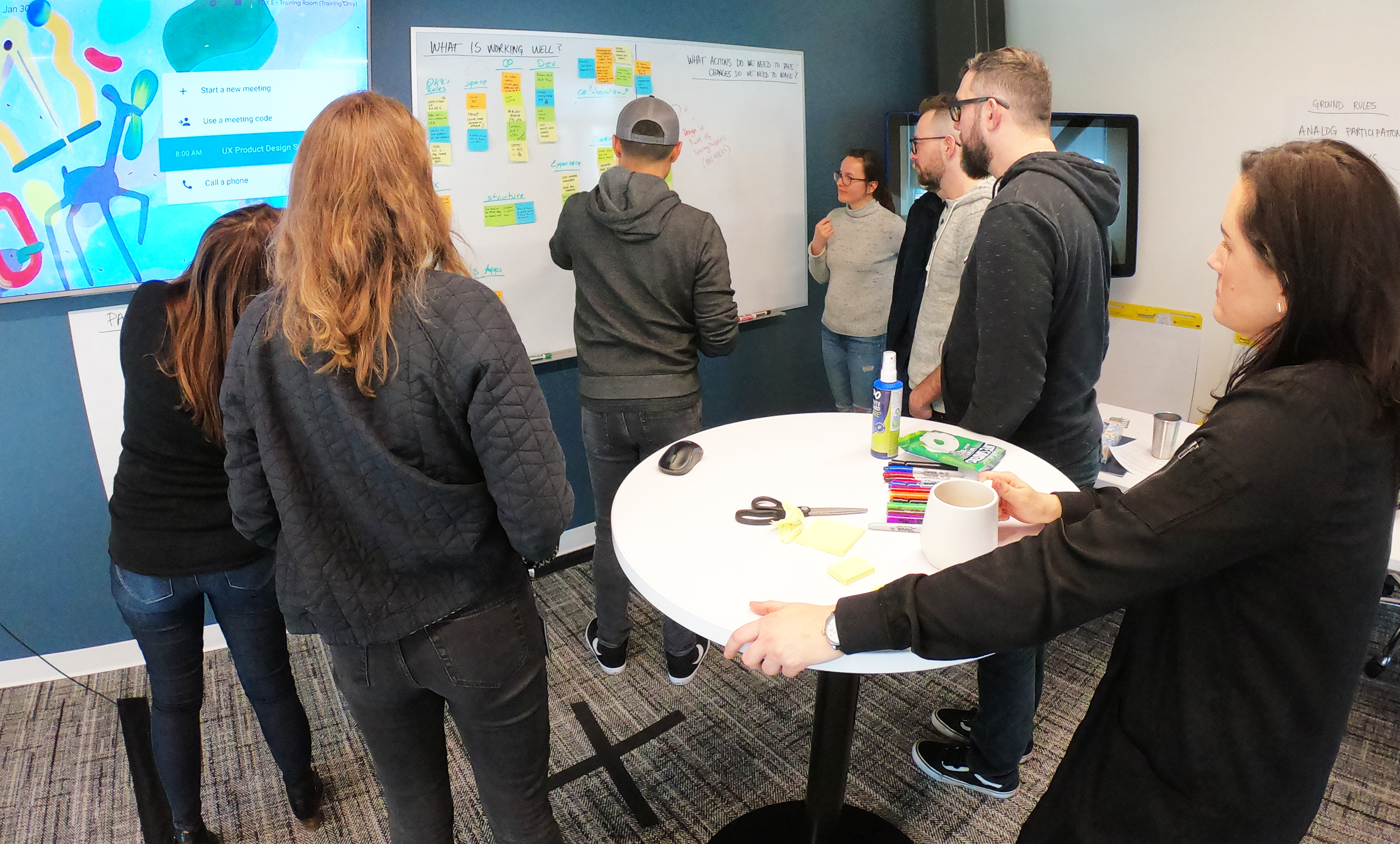
Our analytics team identified drop-off issues on Vacasa’s unit pages. The UX team reviewed the site, data, and known issues. Next, I ran a whiteboard session to surface and review the guests’ needs. I collected some heat map data from Hotjar to see where users were engaging on our site and confirm the areas of drop-off. Then I put together a competitive analysis to understand the table stakes in our industry, followed by a heuristic analysis to identify the key problems on our unit pages. Next I presented my recommended, actionable solutions and assigned priority based on Nielsen’s Ten Usability Heuristics for User Interface Design.


Design
Based on the analysis, the UX team worked together to redesign the unit pages. I took on the image carousel and booking flow. I built a prototype in Sketch and InVision, which was used by our UX researcher to run user tests, and then we incorporated feedback into further improving the pages.
Vacasa has seen a year-over-year direct booking sales increase of 70% on their site to over $40 million a year.
We launched the updated unit pages and continued to refine based on testing. Combined with a site redesign that followed two quarters later, Vacasa has seen year-over-year direct booking sales increase of 70% on our site to over $40 million a year.


